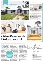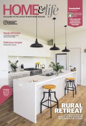
A place for all seasons

Pavilion 135 A place for all seasons

Pavilion 135 A place for all seasons

Designed with family comfort in mind, Sarah Homes' Pavilion 135 is ideal as either a permanent or holiday home

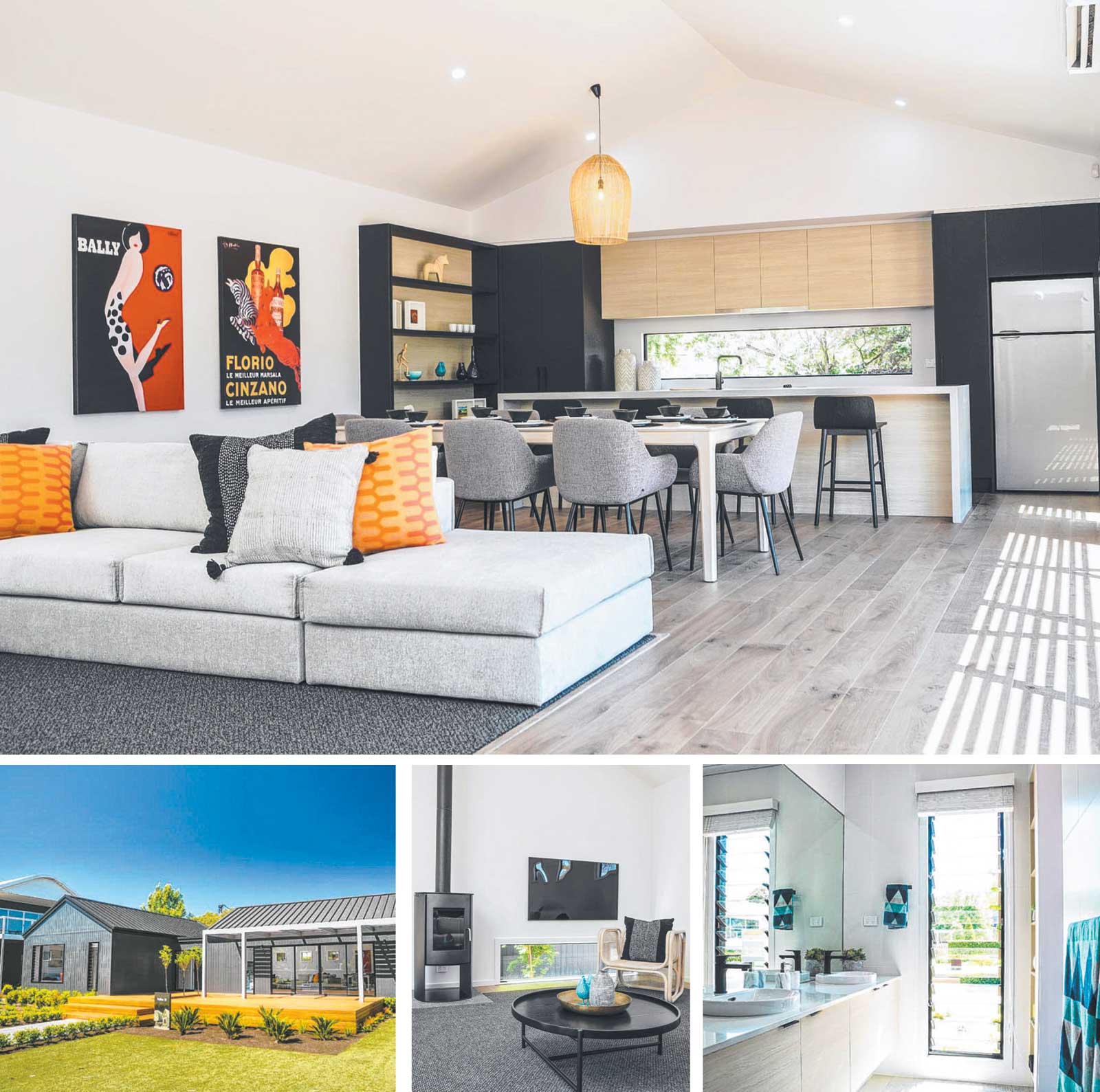
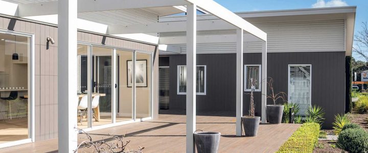
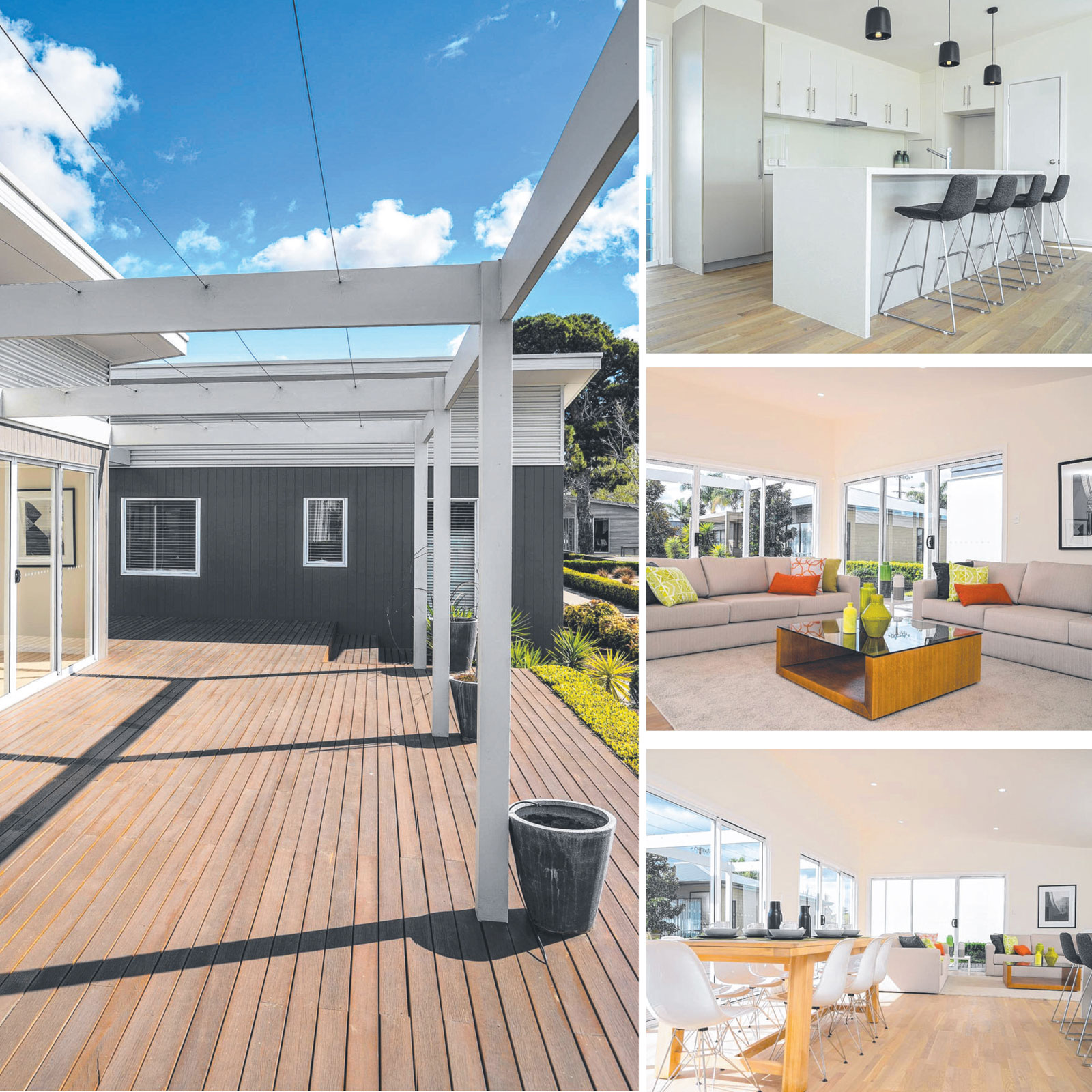
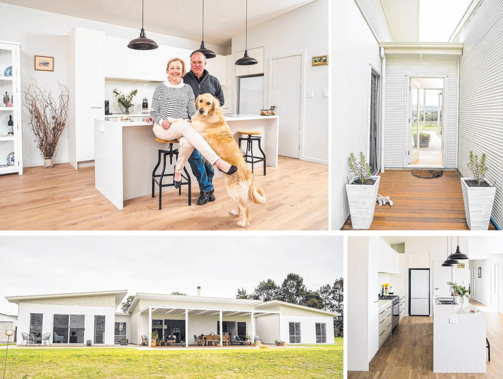
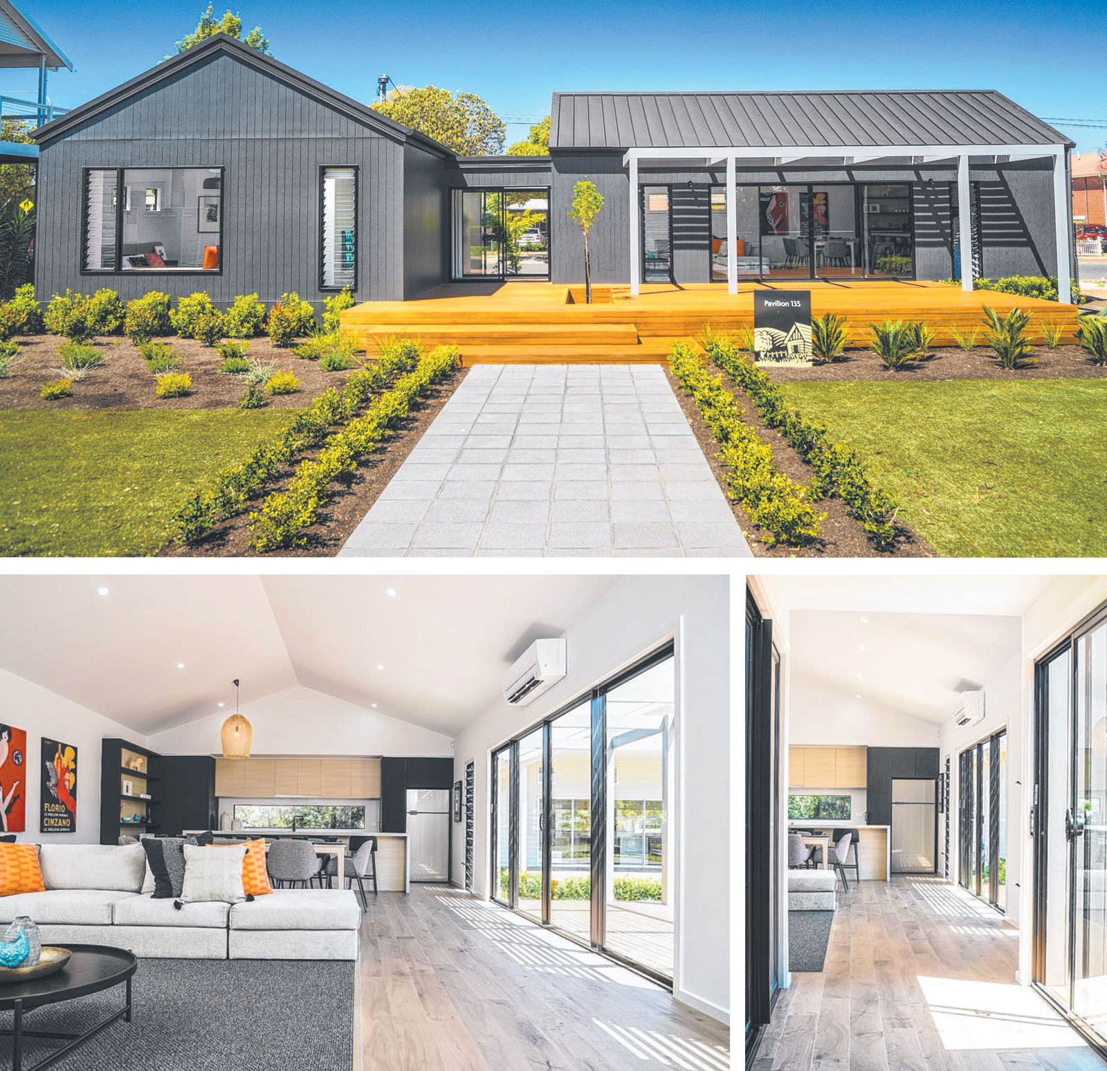
There's a lot more to Sarah Homes' Pavilion 135 than first meets the eye. Designed as two rectangular pods joined by a glass breezeway - with one side as the entrance - the simple but clever format allows the home to work perfectly as either a permanent home or a weekender.

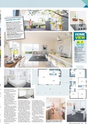
Light-filled and spacious, the three -bedroom Pavilion 135 boasts a streamlined layout with three distinct zones: the living pod, the bedroom pod and the outdoor zone. Sarah Homes' marketing manager Jaye Smith says the design - on show at Mile End - is aimed at a wide variety of potential homebuyers.

"It was designed as a family home, but its smart use of space and open plan living works well for buyers at any stage of life," she says. "The demarcation of the living space from the sleeping zone allows for the hub of family life - a spacious area for eating, entertaining and relaxing - to be separated from the sanctuary of the bedrooms."

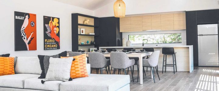
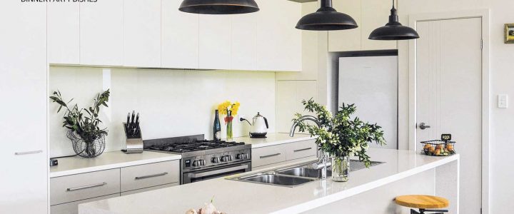
The living pod's large proportions is one of the home's standout features - along with the light that streams in from the windows on all sides. At the far end, the kitchen spreads from one side to the other, and there is plenty of benchtop space to play with. Double round sinks in the island bench are another highlight, as is a side-facing niche cupboard - perfect for hiding the kettle in when not being used. There is no shortage of storage options.

The second pod, with its 2.7m high ceilings, has three bedrooms, plus an ensuite and the main bathroom , all well appointed. The minor bedrooms are of equal size, but the master bedroom also boasts a wide feature window with louvres.

The ensuite is generous with a wide shower, wide vanity and built -in shelves in a narrow alcove is a clever use of space. Extensive timber decking out front is another standout feature, enhancing the design's appeal as a home ideal for "easy summer living". "Our homes are designed to make you feel like you are on holiday every day," Jaye says.


26-Jul-20 - The Sunday Mail Home Magazine

For more information about the house in this story please look at the Pavilion 135.

*Pricing accurate at time of printing 
Pavilion 135 A place for all seasons Full Article


The ultimate summer pavilion

Pavilion 135 the ultimate summer pavilion

Pavilion 135 the ultimate summer pavilion

Style, simplicity and ease come together in a design that will work as either a permanent home or a weekender. Designed in two pods, Sarah Homes' Pavilion 135 offers a new way of living

At first glance, you may think Sarah Homes latest display home is the type of cool residence you'd find in remote wilderness in Norwood or Finland. Its minimalist, Scandinavian barn-like exterior emulates many of the contemporary builds you'll find on Instagram or Pinterest. Homes that are uber cool, but you can tell are built with sustainability and practical living in mind. The best of both worlds, you could say.

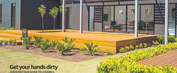
So take it one step further and add a massive kapur timber deck out front and Sarah Homes' Pavilion 135 becomes a true Australian home that is ready for easy summer living. A simple design of two rectangular pods, or pavilions, joined by a glass breezeway with one side as the entrance, this three-bedroom, two bathroom home is strikingly different and that's what home buyers are bound to like about it.

Build it as a permanent home or a holiday home, either way the streamlined layout gives you three distinct zones: a living pod, a bedroom pod and an outdoor zone. However you choose to live in it, there will still be holidays vibes. "Our homes are designed to make you feel like you are on holiday every day," Sarah Homes' marketing manager Jaye Smith says, of the new Mile End display home.

"The strong external architectural styling with subtle Scandinavian influences is a new visual style for our range. The Pavilion 135 also features an impressive, yet cost-effective raked cathedral ceiling, which was designed to maximise the feeling of space and light for this home. "It was designed as a family home, but its smart use of space and open plan living works well for buyers at any stage of life. The demarcation of the living space from the sleeping zone, allows for the hub of family life, a spacious area for eating, entertaining and relaxing, to be separated from the sanctuary of the bedrooms."

Aesthetics count for a lot when choosing a home so for lovers of contemporary design, the cathedral ceiling which rises to 3.4m at the peak in the open-plan living pod will tick a box. "The vibe is at once simple and stylish yet versatile and practical," Jaye says. "The expansive deck, spacious interior and light-filled spaces that are the signature of Sarah Homes, ensures that the home feels naturally at home in our South Australian landscape."

The living pod's large proportions is a key selling point and the fact that it has windows on all sides means natural light isn't an issue. At the far end, the kitchen spreads from one side to the other, and keen home cooks will find plenty of benchtop space to play with. Showcased in the display in matt black and light oak cabinetry, it comes standard with a long window as the splashback which will take advantage of any views your block has.

Double round sinks in the island bench are a cool feature, as is a side-facing niche cupboard, to hide the kettle in when not being used. Rows of drawers will keep storage fans happy and the open shelving (optional) is a good use of space that helps define this zone. On the back wall, smaller square windows add nice decoration and also privacy from neighbours, while a long window at floor level in the lounge, next to the freestanding gas/wood heater (optional), draws the outdoors in. As shown, this window, and the breezeway window, give occupants a garden snapshot and greenery bursts into the indoor space.

"As with all our Sarah Homes' designs, ~ windows and glazing are a highlight feature of this . living space," Jaye says. "In addition to the kitchen's window backsplash, there is a feature lowlight window in the lounge, giving a view through to the central garden as well as expansive louvre windows and sliding doors that open the space out to the deck." Move through to the side-facing bedroom pod and you could easily walk past the laundry without noticing it.

There is no laundry room, but open up what looks like a series of tall linen cupboards and you'll find a surprise: a rather generous European laundry, complete with a long bench, room for the washing machine and dryer, and a heap of open shelving above the bench. "The European-style laundry has allowed us to streamline the utility area of the home, saving on both space and cost," Jaye says. "The laundry as displayed in the Pavilion 135, is a great illustration of how you can better use the space within your home."

The second pod, with 2.7m high ceilings, has three bedrooms, plus an ensuite and the main bathroom, all smartly dressed. The minor bedrooms are of equal size, but the master bedroom will be the space that receives nods of appreciation. A wide window with louvres is shown with a window seat to inspire visitors' thoughts of relaxation.  Like the master, the ensuite is generous with a wide shower, wide vanity and built-in shelves in a narrow alcove is a clever use of space.

Considering the simplicity of this home's layout, a few upgrades to the standard range show how the Pavilion 135 can become next level. And there's flexibility, of course, to suit your block's shape and aspect, whether that's near the beach, in the country or in the suburbs. "The strength of the Pavilion design family is the flexibility that ensures that pods can be sized, moved and rotated independently to allow them to fit on many different sized and oriented blocks," Jaye says. "This home's open layout is perfect to capture both seafront or country views."


19-Jan-20 - The Sunday Mail Home Magazine

For more information about the house in this story please look at the Pavilion 135.

*Pricing accurate at time of printing 
Pavilion 135 the ultimate summer pavilion Magazine CoverPavilion 135 the ultimate summer pavilion Full Article (1)  Pavilion 135 the ultimate summer pavilion Full Article (2)


Step out of the ordinary

Pavilion 140 a step out of the ordinary

Pavilion 140 a step out of the ordinary

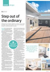
Striking lines and seamless integration of indoors and out make the Pavilion 140 by Sarah Homes a stand out for homebuyers looking for something outside the square

Whenever I bring up buying my first house, my parents always mention how affordable it is to build While I agree, there's still a part of me that wants my first home to be a one-off and appeal to my love for mid-century architecture - incorporating large windows, raked ceilings and a reserved street appeal.

In terms of building a first home, it's a lot to ask - especially given I'll need a large budget to bring that dream to reality. However, visiting Sarah Homes ' Pavilion 140 design made me realise it might not be such a far-fetched dream.

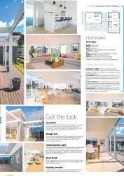
Located at the Pooraka display village, the four-bedroom, two-bathroom design offers an unusual yet striking layout. Split into two pods, the home effortlessly separates the living and sleeping areas and provides 236sqm total size. While the design itself isn't inherently midcentury, it does offer sharp lines, raked ceilings and a seamless integration of indoor and outdoor spaces - features that make mid-century homes so outstanding.

Best suited to a traditional sized allotment, sitting at 19.6m wide and 11.9m deep, the Pavilion 140 would easily look at home in a coastal, rural or suburban setting. Sarah Homes' Helen Lowrie says while the design used to predominantly attract holiday home buyers, it has become a popular option as a permanent residence for many buyers as well.

"We are seeing more and more of our customers buying our designs as permanent homes," she says. "The relaxed, light-filled spaces of our designs help our customers feel like they are on holiday everyday." And this is how I felt the moment I stepped on to the decking and walked into the first pod, which contains the main living areas. As you open the sliding doors, the first thing you notice is how inviting and relaxing the space is. "Featuring warm wood floors and neutral tones, the Pavilion 140's interior style is designed to feel calm and uncluttered, "

Helen says. "The separation of living space from the sleeping pavilion makes this a great home for entertainers." Although I don't often entertain at home, it's hard to not imagine playing host in this design. The kitchen is nothing short of an entertainer's dream with ample bench space on the island and bench behind it, a wall of storage and a step-in pantry, pi us there's a handy breakfast bar that can seat four people.

The dining area and lounge effortlessly take up the rest of the large living pod space, flowing out through multiple sets of sliding doors to the spacious deck. While the wraparound deck offers endless entertaining potential and works to connect the two pods, it is great to see the Pooraka display showcase how it can be integrated with any allotment. The issue of an existing tree on site was no longer an issue, as the deck seamlessly works around it - creating a statement that immediately draws your gaze.

It's this attention to detail that makes the Pavilion 140 such a stand out. As a first homebuyer, I don't expect to have luxurious features and finishes at my fingertips and yet, I was genuinely impressed by what was on offer. As I walked through the dining and living area, I found myself leaning down to touch the floors to see whether they were hardwood - instead it's a clever cost-saving timber-look floating floor that feels and sounds like real timber.

Similarly, the kitchen benchtops have the appeal of solid stone but are a much more affordable Laminex option - a big tick of approval in my book. Heading into the second pod , which is the sleeping and utility quarters, a neat tiled foyer greets you before a lush chocolate brown carpet runs throughout the space. Although I used to overlook these kinds of features, the tiled foyer is another tick of approval - ensuring dirty shoes stay away from the luxurious-feel carpets.

The master suite is set towards the back of the pod and features a large built-in wardrobe and a contemporary ensuite, complete with a stylish subway-tiled feature wall in the double shower. Sliding doors open to a private deck, ideal for a morning coffee when the weather is warm.

The remaining three bedrooms are similar in size and have narrow, tall windows in each allowing natural light to flood in. The central bathroom can be found opposite, and it features a handy bath and shower room, a separate vanity and a separate toilet.

The fourth bedroom has been shown as a study in the Pooraka display, giving added flexibility that's always appreciated in a home. Although I considered this design as a potential option for first homebuyers, Helen says it often attracts families due to the flexibility on offer. "The two separate buildings allow our customers to configure the home to suit their allotment and to maximise any views and natural light," she says.

"You could also introduce additional pods in the future, depending on the available space of your block. Our new home consultants can work with you to custom design a solution to fit your needs." Priced from $103,700*, Helen says the Pavilion 140 display showcases "a mix of the standard specification with some feature upgrades" and has plenty of optional facade choices to suit your style and your block's location.

In terms of first home builds, Sarah Homes' Pavilion 140 doesn't just promise to provide an affordable design, it refreshingly challenges the norm for buyers looking for that defining edge.


08-Sep-19 - The Sunday Mail Home Magazine

For more information about the house in this story please look at the Pavilion 140.

*Pricing accurate at time of printing 
      

All the difference made this design just right

Pavilion 142 the difference made this design just right

Pavilion 142 the difference made this design just right

When the perfect piece of land came up for sale in a rural setting, the Pavilion 4e design by Sarah Homes was the ideal fit for it

When making the jump from renting to building your own home, you don't want to settle for anything less than perfection. Willunga resident Tanya White had lived in the area for 13 years before the right allotment became available. "We fell in love with the town because there is an amazing sense of community here," she says. 'When our block of land came on the market, and it was affordable, we  snapped it up."
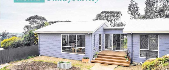
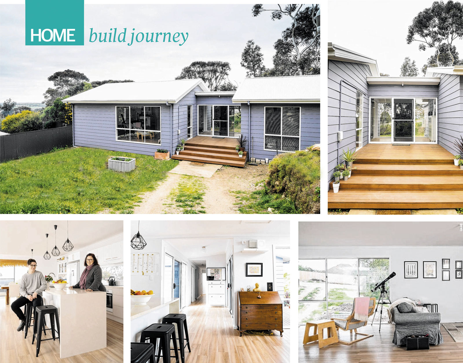
The decision to build her first home with Sarah Homes was simple for Tanya, having already fallen in love with the Pavilion 4e design during visits to their display villages.  Wider than it is deep, with dimensions of 20.7m x 8.7m, the Pavilion 4e design is a modular home with two pods linked by a breezeway. Ideal for wide blocks, the design has a living pod and a pod with sleeping quarters  including four bedrooms, two bathrooms and the laundry.

A large deck is an optional extra that can also be added to the design. "When I purchased the land I wanted to make the most of the views and the Pavilion 4e was just perfect," she says. "It was a design I'd always liked and it just happened to fit perfectly on our block. "Drawn to the obscurity of the design, Tanya made minor tweaks to get the most out of her home, which Sarah Homes were happy to accommodate.

"As a single parent, family budget was a big factor in our build and I'm really pleased with what we managed to include in the build cost," she says  The four -bedroom, two-bathroom design features 140sqm of living space, an ideal size for Tanya and her 15-year-old son Evan, while ensuring there's room to give over the years.  "Because it has four bedrooms and there's only two of us, I get to have a  sewing room and we have a guest room as well as some storage - if anything it will end up being too big rather than too small!" Tanya says.

With a build process of almost a year, Tanya says Sarah Homes' expert advice and consistent communication made the experience as smooth and stress -free as possible. "I had a fabulous consultant called Paula who was just on the same page with me," she says.

"Our building supervisor Zenon was also really great to work with, I came into this build with a reasonable amount of background knowledge and strong ideas of what I wanted and he respected that." Having lived in the home for almost a year and a half, Tanya and Evan are thrilled with the end result.

"We absolutely love it - I never knew how good it was going to feel to own a house but it's just great," Tanya says. "I feel like it's a really functional design that allows us our privacy but also provides a great space for coming together -we love catching up at the dining table while looking at our stunning views."


21-Oct-18 - The Sunday Mail Home Magazine

For more information about the house in this story please look at the Pavilion 142.


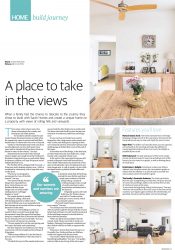
A place to take in the views

Pavilion 145 a great place to take in the views

Pavilion 145 a great place to take in the views

When a family had the chance to relocate to the country they
chose to build with Sarah Homes and create a unique home on
a property with views of rolling hills and vineyards

There comes a time where many of us dream of escaping to the country and leaving the city hustle behind. For southern suburbs couple Sue and Giulio Dimasi, this dream became a reality when the opportunity came to relocate and build their dream home on a farm with views over a vineyard.

"Giulio (a viticulturalist) and I both come from rural backgrounds, we have both spent many years back in suburbia but it has always been our dream to return to the country," Sue says. Attracted by the innovative style of Sarah Homes ' designs, the couple chose the Pavilion 145 floorplan to base their home on, particularly liking its openness, skillion roof, large living area and an independent kids' area.

The Pavilion 145 is a designed with two pods - a living zone and a sleeping quarters zone - which is connected by a breezeway, with a large deck area out the front. "The house was designed to incorporate the views of the hills beyond," Sue says.

"We started with the Pavilion design then expanded from there. Sarah Homes are very flexible with their home designs and can easily modify existing plans to suit bigger families or needs."  The couple decided to modify the design by adding a third pod , with sleeping quarters on either side of the central living zone to accommodate both their teenage son at one end and have a wing to themselves at the other.
"Because we were building on a farm we needed to find a country house design that incorporated a long thin aspect that had glass along one complete side of the house that allowed for our stunning views across the hills," Sue says. "Our sunsets and sunrises are amazing. "We also wanted it to suit the rural setting, and have space for family and entertaining."

The four -bedroom, two-bathroom, two-living room home is 29.2m in length and has 212sqm of living space. "With teenage children it is nice for them to have an area to themselves when they need it," Sue says. "We liked the layout of the master bedroom in  one pod and the other bedrooms in another pod. The house also lends itself to guests staying over with their own bedroom, bathroom and lounge area."

At one end, Sue and Giulio have a pod to themselves with a large master suite, ensuite and walk-in robe, and sliding doors opening to their own courtyard out front. The home 's entrance and double garage sit behind their room at this end of the home. At the other end of the design, in the third pod, are three bedrooms, the main bathroom, a huge laundry and a snug kids' retreat room.

In the centre is the open -plan living zone with a raked ceiling and views both front and back. Their stylish white kitchen sits at the back of this space overlooking the views, the dining zone and main lounge area. A walk-in pantry is a plus while the island bench is polished in fresh whites and clean lines.

A sheltered raised deck off the living extends this zone further and there's ample space outdoors to fit their dining setting, a couple of  reclining loungers and a couple of comfy armchairs to enjoy long lunches and barbecues in the open air.

Originally quoted a 20-week build time, the Dimasi's home was built in 17 weeks and the family got to move in early, which was a pleasant surprise.  "We found Sarah Homes fantastic in every respect," Sue says. "Our build process was extremely smooth. After we got through the red tape with the council (which had nothing to do with Sarah Homes) each of the build stages seemed to dovetail back-to-back relatively smoothly.

"When we did hit some problems with the council, Sarah Homes were able to assist us in finding a Planning Development consultant and they worked with him to build an argument for our case."

Having now lived in their home for just over 12 months, Sue, Giulio and their son Mathew, couldn't be happier with the end result. "Our house is filled with family and now a beautiful granddaughter," Sue says. "Our golden retriever Bella is also loving all the extra space."


16-Sep-18 - The Sunday Mail Home Magazine

For more information about the house in this story please look at the Pavilion 145.


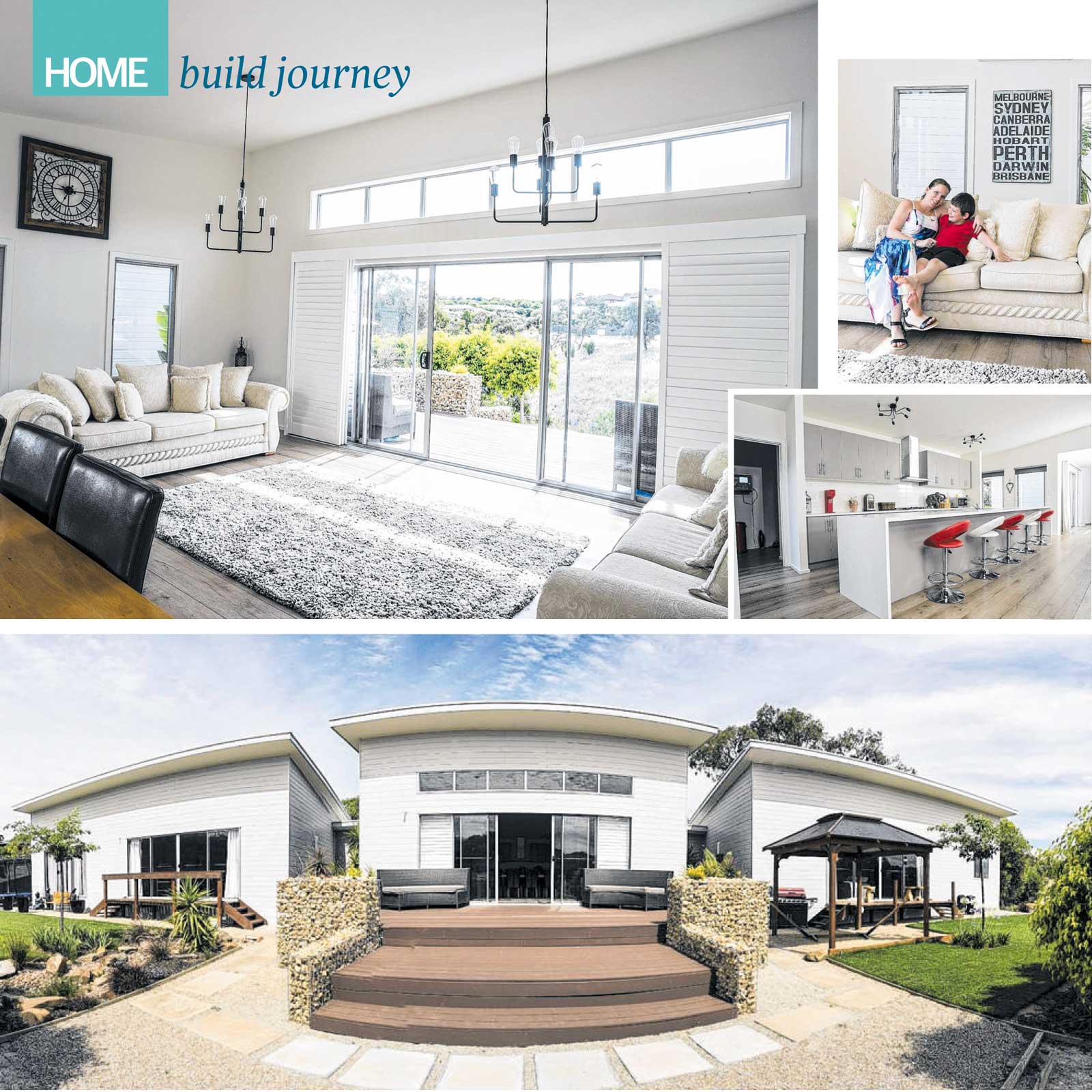
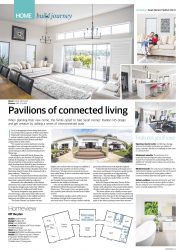
Pavilions of connected living

Pavilion 145 a series of interconnected pods

Pavilion 145 a series of interconnected pods

When planning their new home. this family opted to take Sarah Homes' Pavilion 145 design and get creative by adding a series of interconnected pods

If you're struggling to find a design that meets your needs, take a page out of Shane and Sherri Grimwade's book and get creative. The north eastern suburbs couple wanted a cost-efficient home that reflected their lifestyle and didn't compromise on their needs. "We wanted our master bedroom to be big enough to have a lounge, the ensuite to be big, the kids' rooms to be large and we wanted a decent size gym, office and entertaining room," Shane says.

Deciding to build with Sarah Homes, the couple settled on the Pavilion 145 design but instead of enlarging it to suit their family, they chose to build an extra pavilion, resulting in a triple frontage home linked by glass breezeways. "We chose Sarah Homes after seeing their sister company Atlas Living's displays where they had extensions for homes that connected with a glass walkway," Shane says. "My idea was to take three of these extensions, remove and reconfigure the internal rooms and have them connected with the walkways."

Attracted by the affordability of the linked extensions, the couple worked with Sarah Homes to merge the designs and create their ultimate three-bedroom, 2.5-bathroom family home. The family designed a large games room/ second lounge, a gym and a home office in one pod, a main living zone in the middle and three bedrooms and bathrooms in another pod. "The Sarah Homes ' rep Katina was very helpful, she worked with our design to establish if it could be done and then set about costing,"

Shane says. "My idea was to use each pod, as we have called them , to have room sizes and a layout that we wanted." While the approval process took 18 months to get through the local council, it only took nine months for the build to be finished. "Our site was difficult and sloping, but it was still finished within the expected timeframe," Shane says. "The country views are great and it's very peaceful, and still only minutes from Golden Grove."

Reflecting the modern nature of the home, the interior is bright with a warm french provincial style. Floor -to-ceiling windows and the glass links fill the home with light throughout. "I think the kitchen/dining and lounge area is the nicest, working out in the gym is great too due to the views, especially on a foggy morning, Shane says. "The only thing I might have done differently would be to make better use of the views to the north."

With 393.59sqm of total size, 12m by 40.9m dimensions, this design makes the most of the family's wide allotment, views and provides plenty of indoor and outdoor space for years to come. "The home allows us as a family to have quiet spaces for ourselves, the kids' rooms are plenty big enough for when they get to the teenage years and beyond," Shane says. "We would consider building again in the future, perhaps somewhere warmer."


04-Feb-18 - The Sunday Mail Home Magazine

For more information about the house in this story please look at the Pavilion 145.


Get Away From it All

Pavilion 140 offers a holiday home with a resort feel

Pavilion 140 offers a holiday home with a resort feel

The Pavilion 140 by Sarah Homes offers a holiday home with a resort feel that's completely different

As kids we loved going to our friends' beach shack during the summer holidays, it was a basic rectangle with sliding doors facing out to the view. Ever since then I've always wanted a beach house, and in my mind it was always going to be something simple, where we could chill out and it didn't matter if sand came inside.

Well, I think I have found a design that fits that simplicity but at the same time impresses with its cool vibe and unusual concept. Sarah Homes' four bedroom two-bathroom Pavilion 140 is just one of the brand's many holiday home designs, but this one is a bit different and it takes "zoning" to a new level.

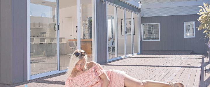
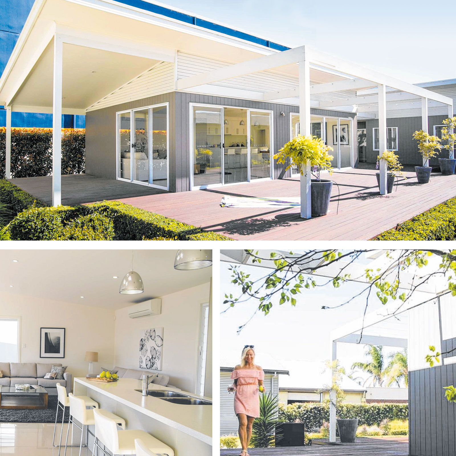
Essentially what you have are two very simple, separate rectangles, both with single pitch rooflines and skillion ceilings. One is the living zone and one is the sleeping quarters and utility rooms, including the laundry and bathrooms. On display at Pooraka, the Pavilion 140 has one building (or pavilion) positioned across the block, while the other building sits in front lengthwise.

In between, connecting the two pavilions, is a big timber deck with an arbour painted in crisp white. What's great about this design is the two separate buildings can be configured to suit your allotment and to maximise any views. Sarah Homes' Helen Lowrie says the Pavilion 140's unique design is rarely changed by clients. What does vary is the deck.

"The main thing that people change are the decking areas," she says. "The size of these depends on their land size and entertaining needs. "The home is quite different as both the sleeping and living module can be placed anywhere and in any direction on a block, so it offers a lot of flexibility. "Quite often clients add car accommodation." I love the look of this design: the huge deck, the roof pitch, the mix of corrugate and cladding in dark grey, and the arbour you can grow a vine up.

It has a real beachy look and feel. I also love the idea of separate zones, so the kids can head off to bed when it's getting late, and you and your friends can still be at the other end of the deck, going back and forth through the living area without any concern about disturbing the little ones' sleep. You're still not far away if a child calls out, either.

The Pavilion 140 display aligns sliding doors in each building, so there's an outdoor walkway only a few steps from one to the other. This could be enclosed if you prefer or covered with a vine or pergola if you want protection from the weather. "The Pavilion 140 brings a new dimension to the weekend getaway," Helen says. "The inspiration for the design was to really enjoy an entertaining area without it impeding on anyone who wants some quiet time or sleep, as they are completely separated from the living area."

While the exterior shape is simple, inside a neutral palette of whites and light tones throughout keeps the interior clean and relaxed and acts as an ideal base to add your personality. The high ceiling pitch allows light to flood in, while large format gloss floor tiles reflect the light, adding shine to the living area.

In the display, the home has been treated to a stonetop island bench with a waterfall edge and a breakfast bar overhang for casual meals. Retro-style pendants zone the well-equipped kitchen, which offers plenty of storage, Blum soft-closing drawers and a walk-in pantry. The kitchen is positioned adjacent the doors that lead to the next pavilion, so it is also within easy reach of hungry occupants.

The rest of the open-plan living comprises a good space for the dining table and on the other side of the room is the lounge area. With four sets of sliding doors off this pavilion (on three sides), each space opens straight on to the deck for seamless summer living, and for thermal efficiency and cross ventilation.

In the second pavilion, the ensuite and main bathroom have been streamlined with wall-hanging gloss-finish vanities, stone tops and above-counter basins. The ensuite offers a generous shower, while in the main three-way bathroom, there's a bath and a second shower. Bedrooms are kept simple with soft carpet, wardrobes and tall windows for light and privacy.

"This home is often built with a very large entertaining deck," Helen says. And as this is a holiday home design, Sarah Homes will build it anywhere in SA.


18-Oct-15 - The Sunday Mail Home Magazine

For more information about the house in this story please look at the Pavilion 140.


Right Menu Icon